Fard
Project summary
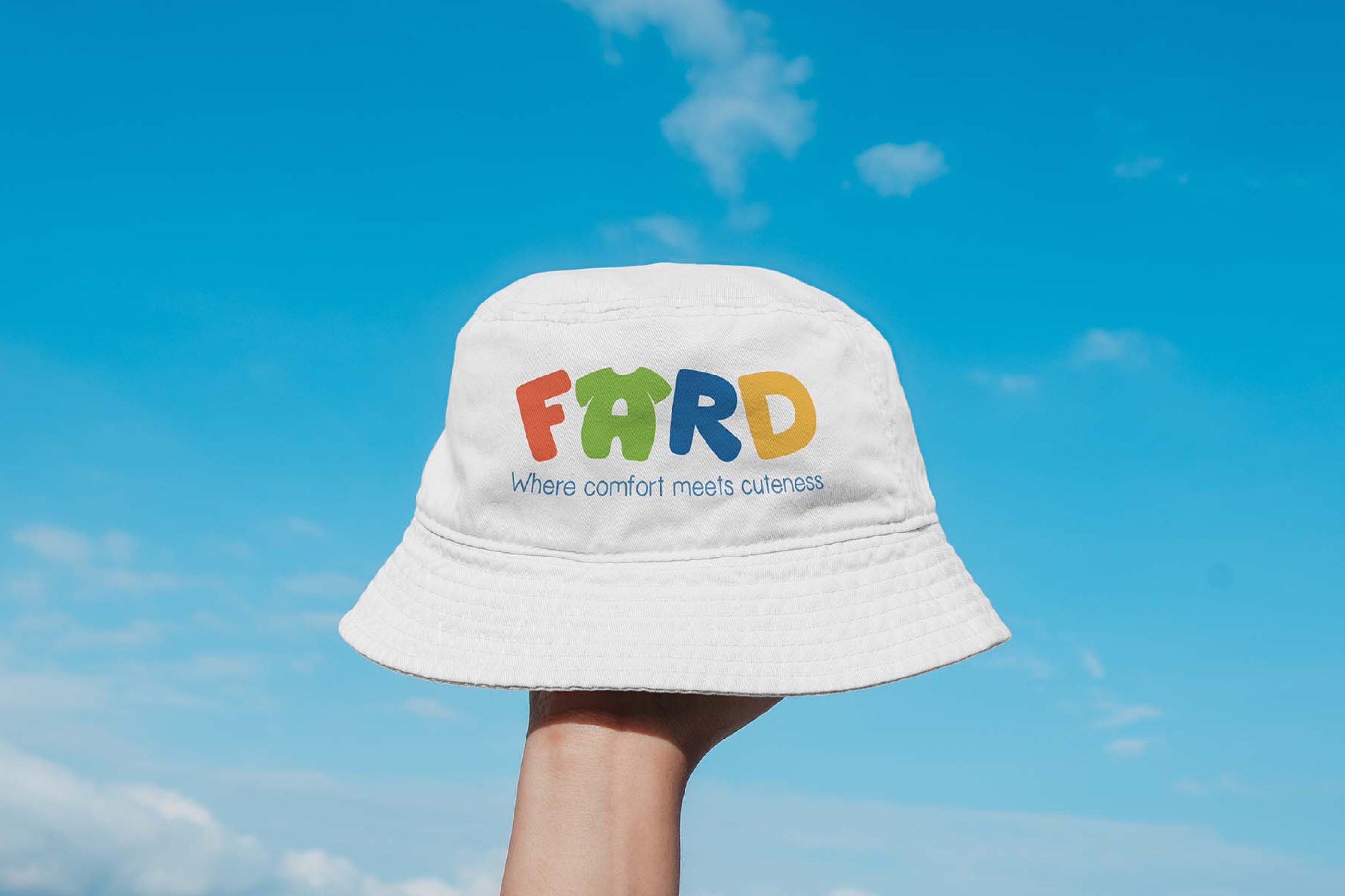
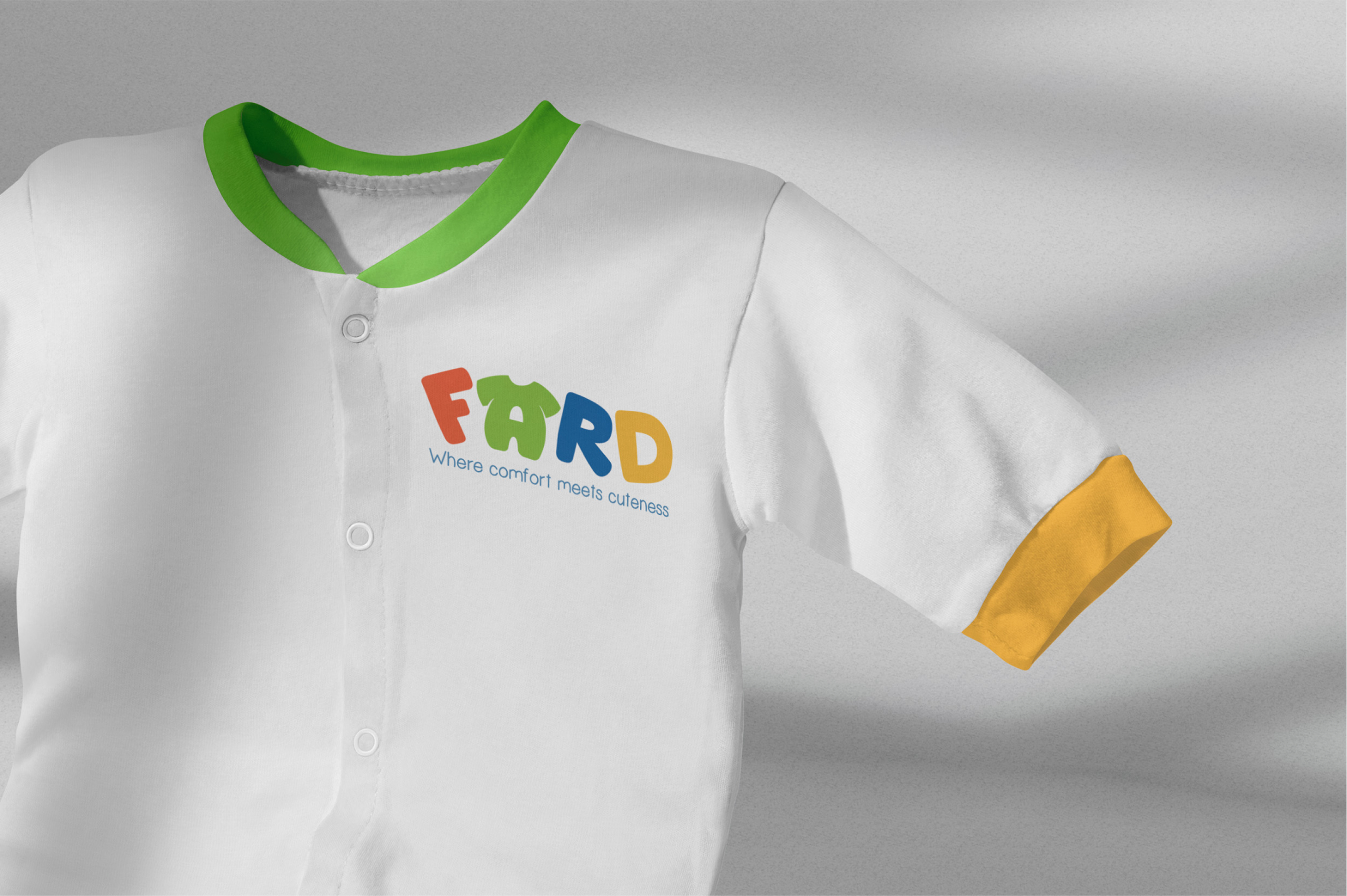
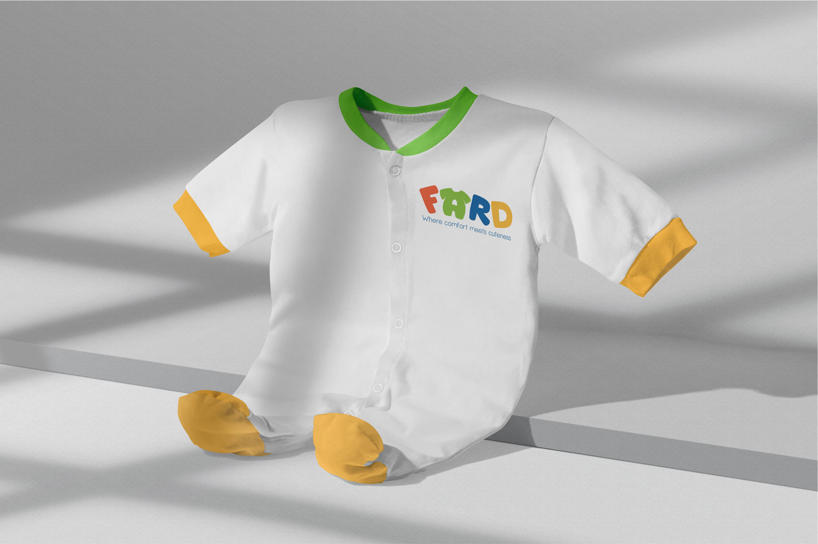
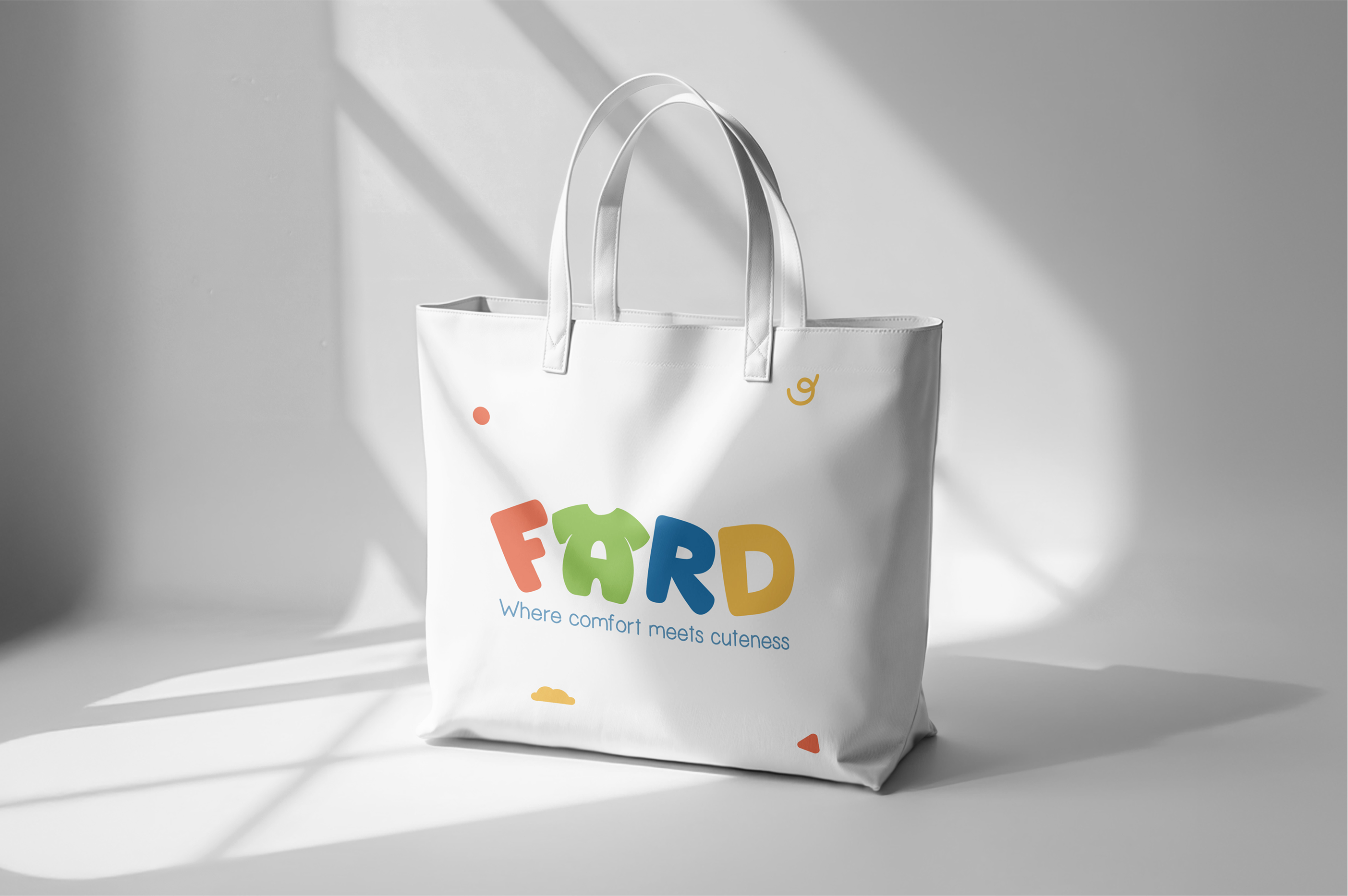
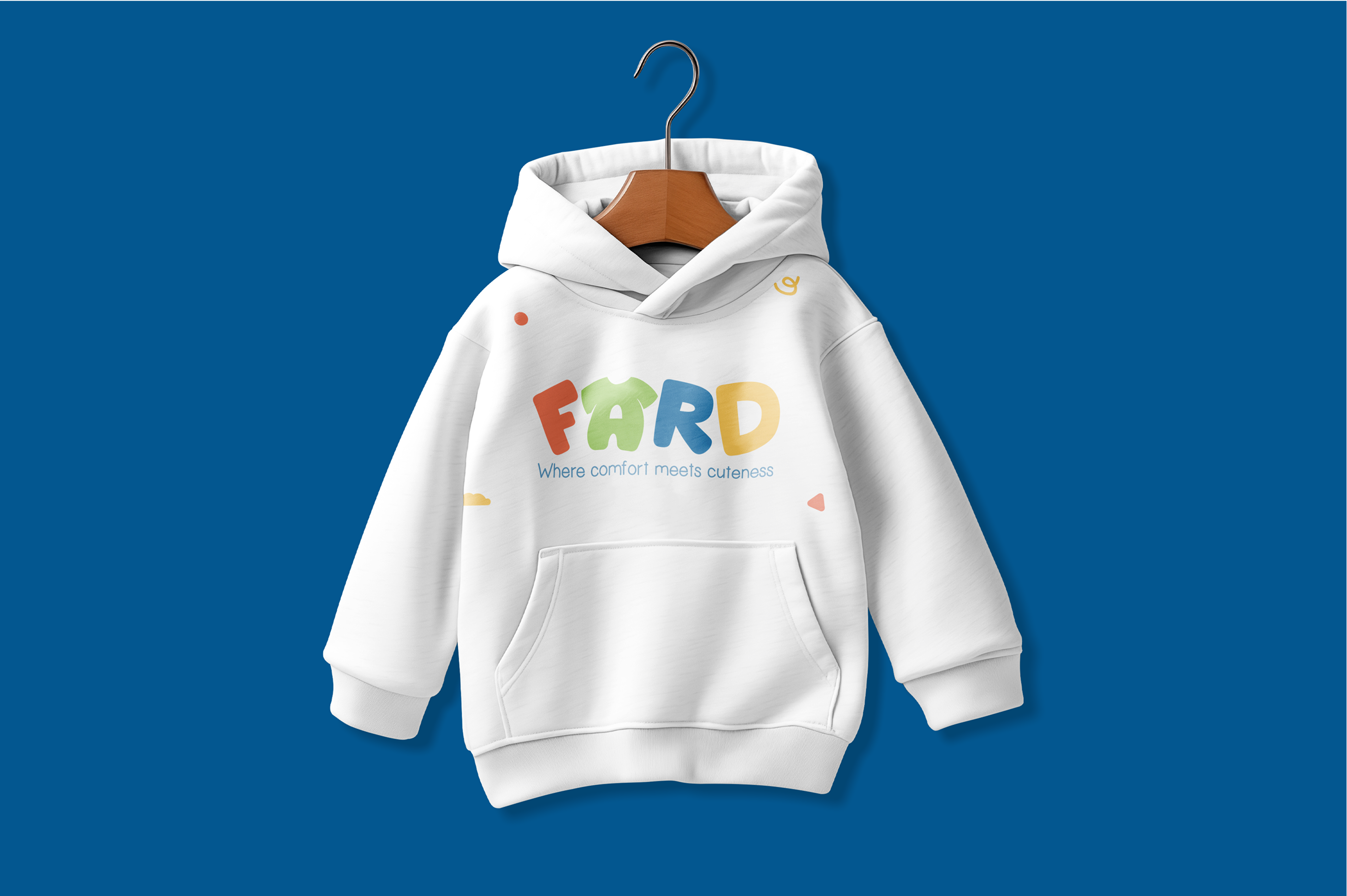
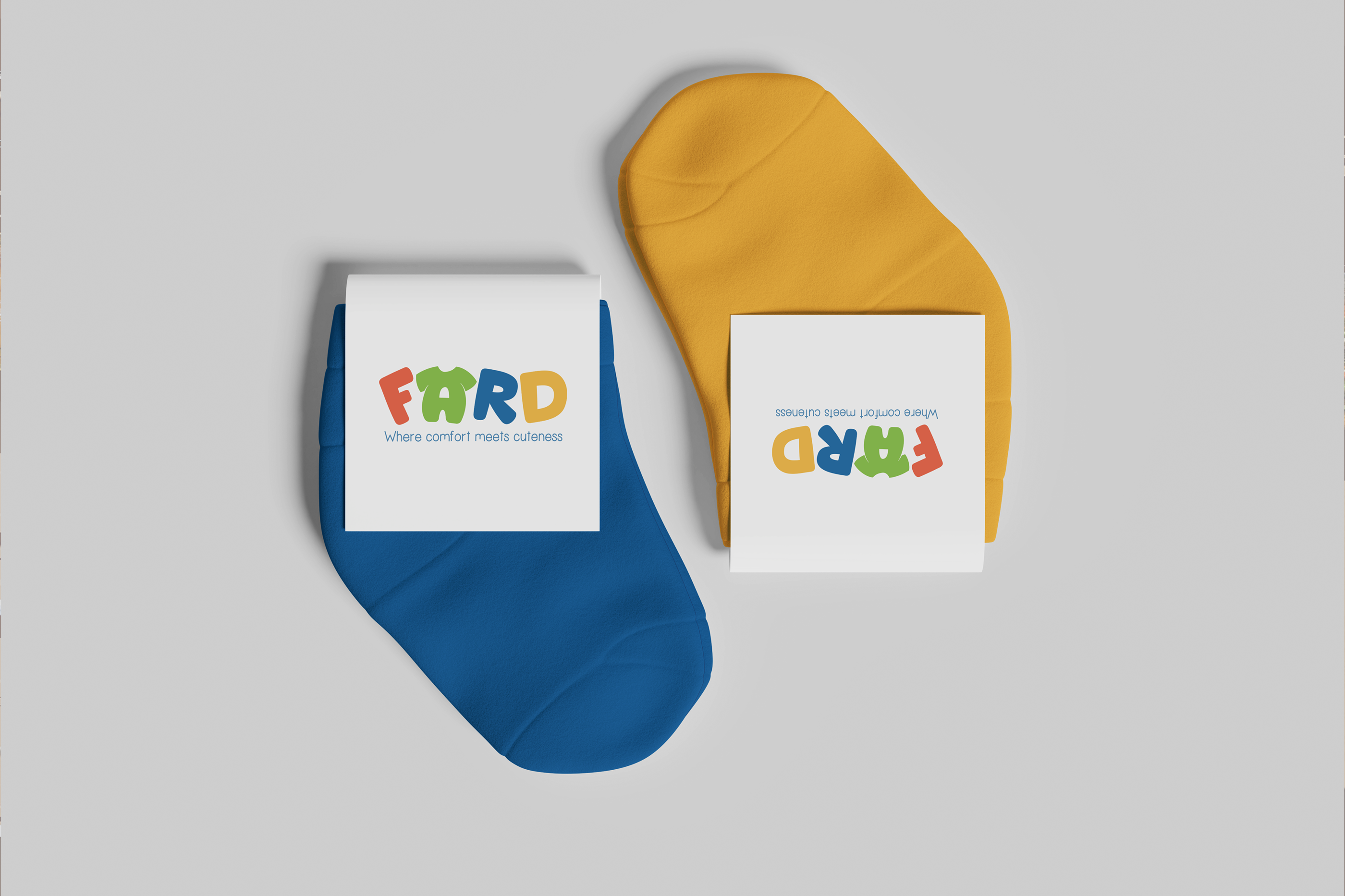
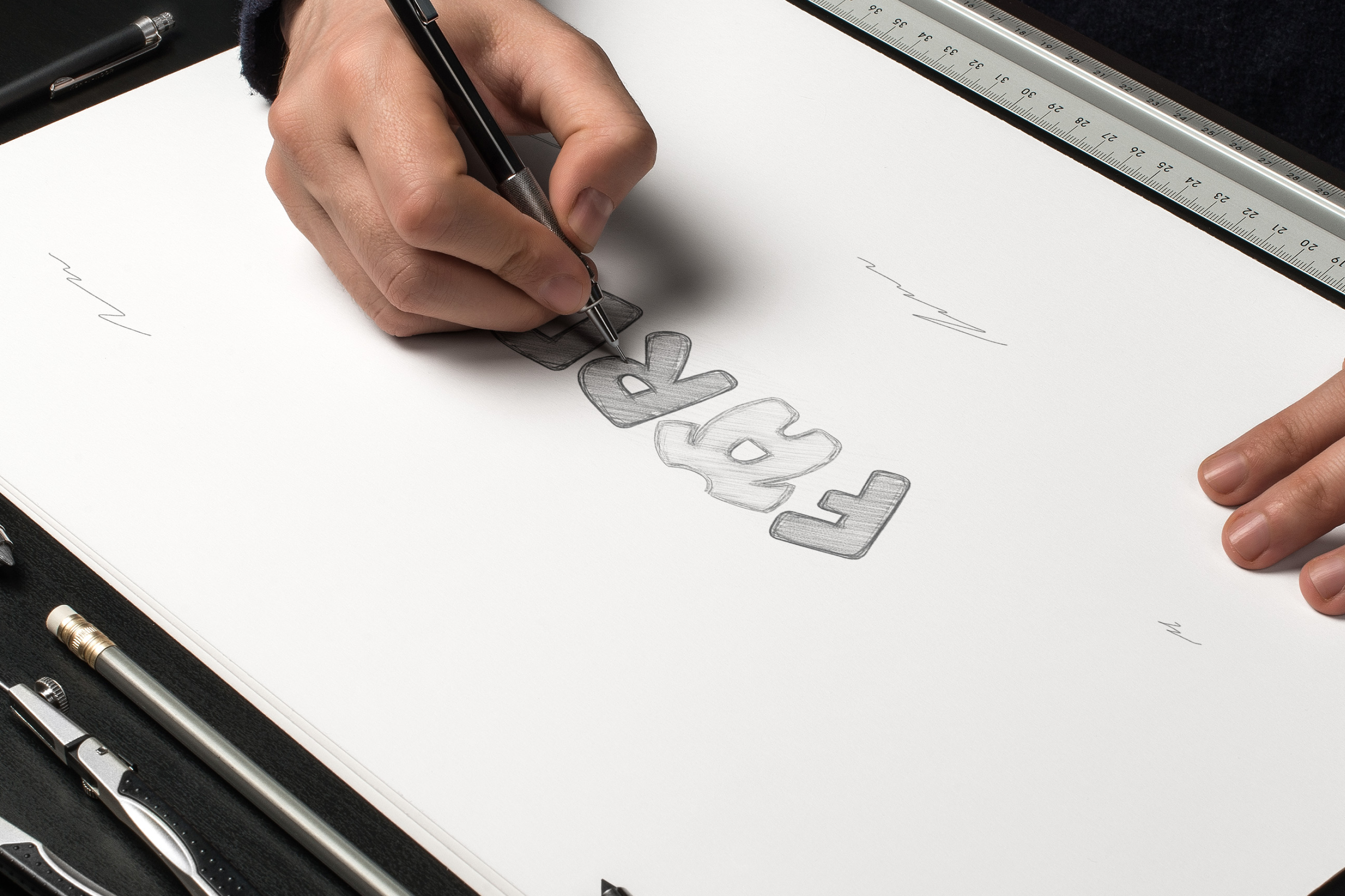
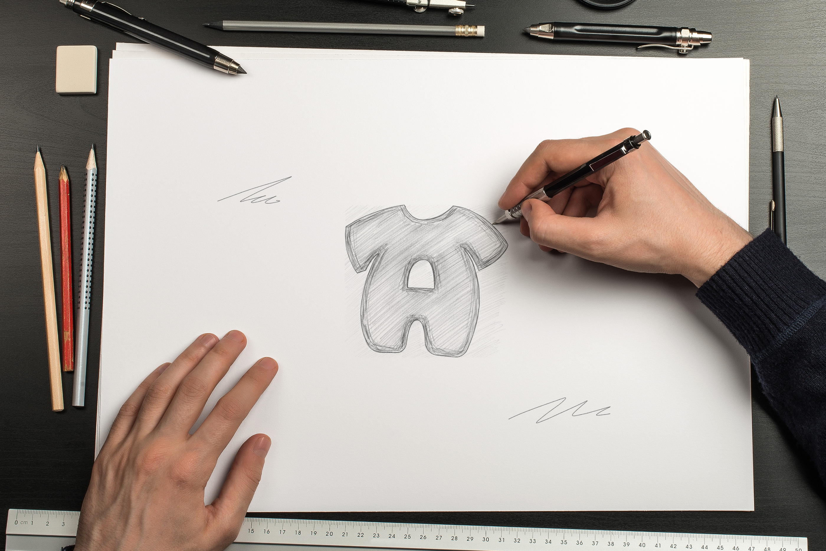
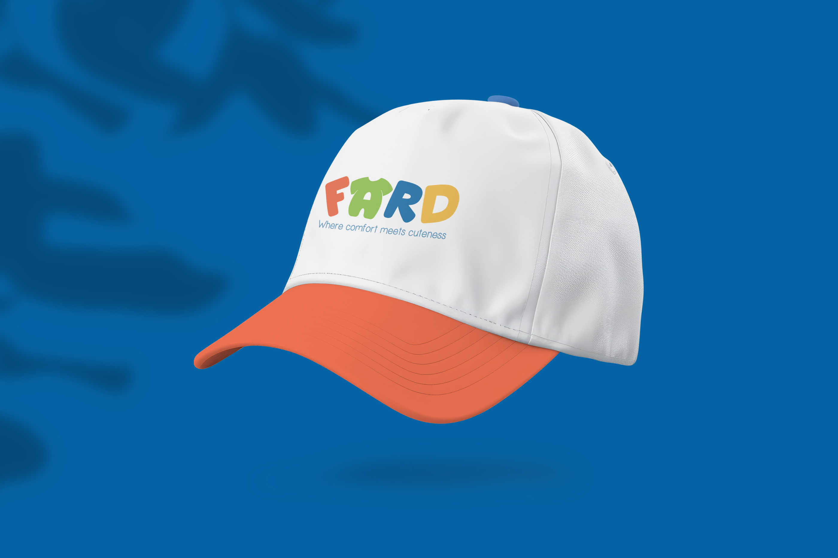
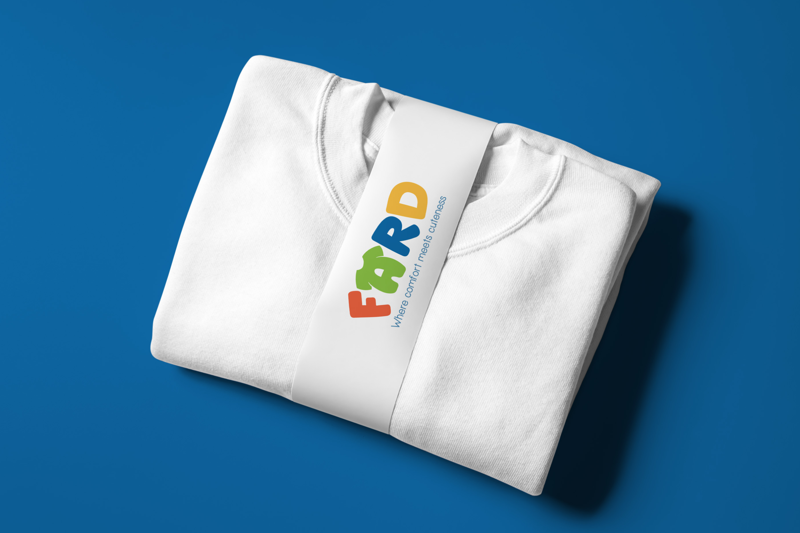
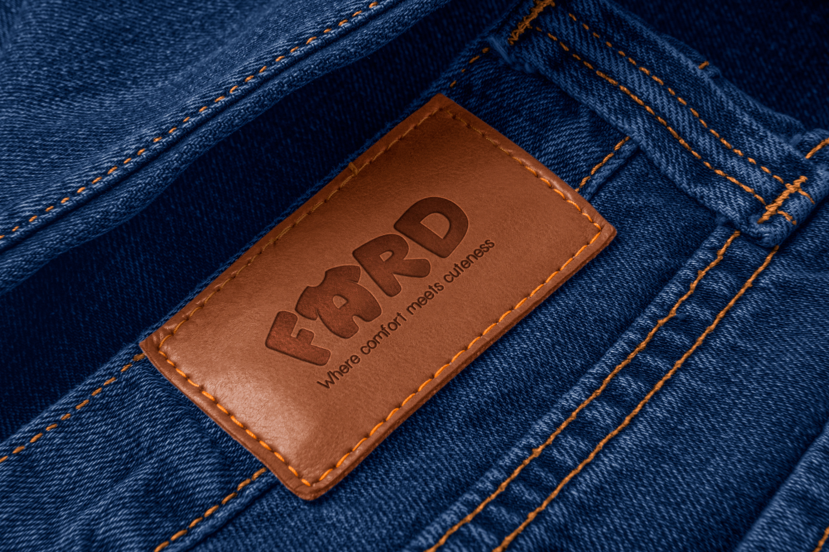
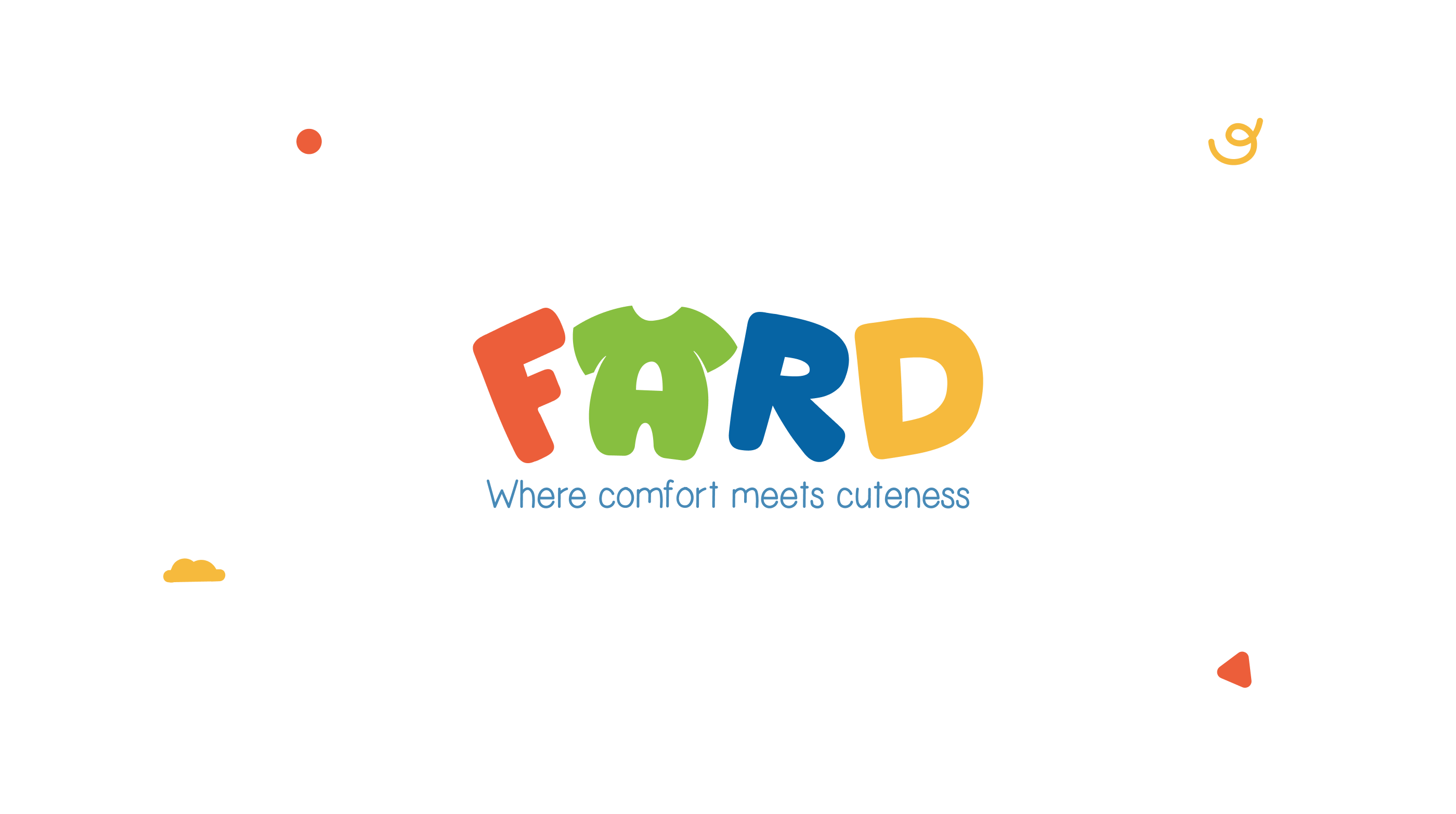
FARD sells kidswear where comfort comes first and cuteness comes right after, and it needed an identity that parents would trust and kids would remember. Kidswear branding tends to look the same everywhere: rounded fonts, pastels, a cartoon animal. So we went another way. We turned the “A” into a tiny pair of dungarees, which ties the name straight to the product and gives the logo a character without needing a mascot. Around it, custom letterforms lean and tilt at their own angles, the way kids do, adding a spontaneous, carefree energy that keeps the wordmark from feeling stiff. A bright palette of green, red, blue and yellow finishes it off: cheerful, varied and open to every kid. The result is an identity that works on a collar tag as easily as on packaging, and gives FARD a personality of its own in a crowded category.

We’re listening.
Every project we’ve ever taken on started with someone filling out a form just like this one.
hello@beardeddesigner.com